Thursday, August 29, 2013

Glazing...with Potters Choice Glazes!


I'm getting ready to glaze my maple leaves...


in some fall colors!


This is the orange glaze I use...PC-52 Deep Sienna Speckle. 
For some reason, my pieces come out darker than this,
but I really like it. I love Potters Choice Glazes!
 
They're user friendly and very consistent.


This is the red glaze I use...PC-59 Deep Firebrick. 
I call it autumn red...for my leaves, and on my dinnerware.
For my hearts, I call it Vampire Red...because it looks like blood! 
When I fire this red, it always comes out darker than these test tiles.
 
I'm glad though, I like it better!


I'm going to glaze some in this color...PC-23 Indigo Float.
I usually just call it Indigo, or Cobalt Blue.
I love this glaze!


This is the Indigo, fired in my kiln. 
This one comes out darker than the test tiles too.
 
It's a beautiful blue!


I'm going to try some in this color...PC-20 Blue Rutile.
I've only used it once, on a small leaf...so I'm looking forward
to trying it on something a little larger.


This one is darker too, but I like it.


Going to glaze a few in this color...PC-29 Deep Olive Speckle.


And I'm going to do a few in this color combination...
PC-30 Temmoku over PC-29 Deep Olive Speckle. 
I've tested these two already, and it came out good.
Just not sure how it works with texture?
The test tile I used was plain. I'm too impatience to test it again.
 So, I'm just going to try it on a leaf and see what happens.


Going to do some in this color combination...
PC-41 Vert Lustre over PC-29 Deep Olive Speckle.
I've used this color combination several times,
 this is what it looks like when I fire it in my kiln...


It's great on texture!


I'm going to try this color combination...
PC-52 Deep Sienna Speckle over PC-29 Deep Olive Speckle. 
Hope it looks something like this? I like it,
I think it would look nice on some leaves.
It'll probably be a little darker though,
since all the other glazes come out darker.
 
We'll see!


This color combination...
PC-53 Ancient Jasper over PC-29 Deep Olive Speckle.
Might be nice to try. I think it would look good
on some autumn leaves. What do you think?


 I'm definitely going to try some in this glaze...
PC-55 Chun Plum. I have two bottles,
and haven't tried it yet. I'm just going to go ahead
and glaze some leaves without testing it first.
 But I will do a test tile with texture,
so I can see how it reacts with the texture.
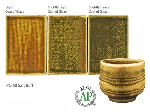


 I'm not sure if I should try this glaze...
PC-60 Salt Buff. I have a bottle,
and haven't tried it yet.
If I put it on a little heavy...hopefully it will
look like the test tile on the right.
Still haven't decided if I should just go ahead
and try it, or do a test tile first?
 
Maybe I should test it first!


What do you think about these colors?
 
 
Which one is your favorite?
 
 
I'd love to know what you think!


Tuesday, August 27, 2013

Ravens


The view from my workshop window...


inspired me to make this raven bowl.


I see this everyday...


So, I decided to make one!


And I made these too!


I think they came out cute!

Coming soon!


Wednesday, July 31, 2013

Pottery Photo Tips


How I Take My Photos!


Before I opened my Etsy Shop, almost three years ago.
I purchased these lamps, and a light tent.
 
I think I only used the light tent, once or twice...I hated it!
It was a big waste of money! It just takes up room in my closet now.
 
Then I purchased a varitone graduated backdrop #09.
It was better than the light tent, but I wasn't happy with the dark background.


This is one of my first photos with the varitone backdrop.


This is the same photo, that I edited on
 
 
It was a little better, but I still wasn't happy with the dark background.
 
So, I purchased a gray graduated backdrop #28.
I was really hoping that the light gray one, would be better...but it wasn't!


So, after spending all that money, and not being happy with the results,
I came up with my own backdrop, and it didn't cost very much!
Actually, I don't think I spent any money, because I already had everything I needed!
 
I cut up two (free) priority mail boxes from the Post Office...the large ones.
I taped them together with shipping tape, and made flaps on the ends,
 so it could stand. Then I covered the spaces that light would shine through,
with small pieces of white card stock that I had laying around, and then taped 
the card stock to my new backdrop with shipping tape...on the front and back.


Here's a closer view!
 
Once the backdrop was finished, I taped a sheet of white poster board to it,
to cover up the print. Then, I remembered that I had a piece of foam core board,
 so I dug it out of my closet, and placed it in front of the backdrop.


Once that was done, I used another sheet of white poster board
over the first one, tapped it...about half way down the first sheet,
 with some scotch tape, and then draped it over the foam core board.


Then I set up my lamps, one on top of my workbench, and two on the floor!
 
I don't have an expensive camera...not yet anyway! Hopefully someday I will.
But you can still have great looking photos, even if you don't have a really good camera.
My camera doesn't have white balance, or anything fancy, so I have to edit my photos.
Even though I'm using white poster board, and lamps, the photos still come out dark and
kind of gray (oh, by the way...I don't use the flash on my camera)
 
Once I take my photos, I go to picmonkey.com and edit them.
It's free, but you can upgrade for just $4.99 a month...it's well worth it!


This is an unedited photo. See what I mean, not very appealing!
It looks terrible!!!


This is what it looks like after editing and cropping it on picmonkey.com
Now, this is much better! Yay!
 
Here's what I do!
 
I go to picmonkey.com, click on edit a photo, and select the photo I want to edit.
Then I click on exposure, I slide the highlights bar over to where it looks good,
then I slide the shadows bar to where I think it should be and click apply.
Just play with it, you'll get the hang of it in no time! It's really easy.
 
Once I do that, I go to the icons on the left...the second one down is the effects icon.
Click on it, then scroll down until you see frost, click on it and apply. You can lighten
up your photo with frost as many times as it takes, to get it the way you want.
 
Then go back to the icons on the left, and click on the first icon...basic edits.
Now depending on what I want to do with my photo, I'll either click on crop,
and crop my photo, or I'll click on sharpen and then crop. When I click on sharpen
I slide over the sharpness bar, usually about 20%, and click apply. Then I slide over the
clarity bar, usually about 20% and click apply. Just play with it and have fun!
 
Before you know it, you'll have great looking photos,
and not have to spend a lot of money!
 
It's easy!!!


Before editing!


After editing!


Before!


After!


Before!


After!


Before!


After!


Before!


After!


Before!


After!
 
 
I do recommend that you invest in some really good lamps, with diffusers!
That was money well spent! I use them all the time!  
 
 
Hope this helps you have great looking photos!


Tuesday, May 28, 2013

Giveaway Winner


And The Winner is..."Plantation Breeze"


Picked by Adriana the Librarian from
 
 
and


Thanks so much Adriana...I love it!

Monday, May 27, 2013

Etsy Front Page


Thanks so much Kerri Hoey from KLHoey! : ) 

Tuesday, May 21, 2013

Front Page!


Thanks so much Natalie Eberly from TheSilkMoon! : ) 

Saturday, May 18, 2013

Giveaway!


Name...this new Dinnerware Collection

 and Win one of these Tapas Plates!


I need a name for this collection!


I don't want names for the colors, I want a name for the collection.
For example...my coastal dinnerware is called Backwater Bay!


There will be a lot of different colors in this collection.
cream, vintage blue, bronze, rustic mustard, burnt orange,
indigo blue, vampire red, olive, scarlet red, steal grey and more!
I'll figure out the names for the colors later.


So...If you'd like to win one of these plates, pick a name, post it in the comments section,
 if you're not already following me, give me a follow, if you want.
Share this with you're friends, so they can have a chance to win.
 
There are no rules...just pick a name!


You can pick as many names as you would like!
That gives you more chances to win!


One name per comment please!


Ohh...I almost forgot!
 
U.S. shipping only!


Don't forget to leave me a way to contact you!
 
Good Luck!